20 Minuten App Redesign
A UX/UI design project focused on improving the 20 Minuten news app experience for young adult users.
This prototype explores solutions to enhance engagement and appeal to younger demographics while maintaining the core functionality of a news application.
Project Overview
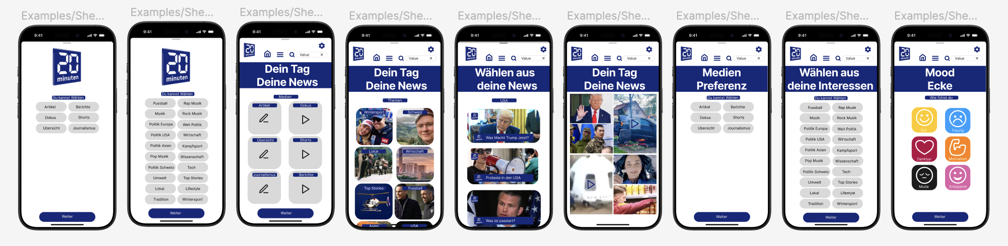
20 Minuten is a popular Swiss news publication, and this redesign project focuses on addressing the challenge of attracting and retaining younger readers in an increasingly competitive digital media landscape. The prototype demonstrates a refreshed user interface with improved navigation, content presentation, and interactive features designed specifically for young adult preferences.
Design Approach
The redesign approach prioritizes clean visual hierarchy, intuitive navigation, and engaging content formats that appeal to younger users. Special attention was given to creating a more immersive reading experience while maintaining quick access to breaking news and diverse content categories.
Key Features
Improved Navigation
Streamlined category access and personalized content feeds based on user preferences and reading habits.
Visual Content Focus
Enhanced presentation of images, videos, and interactive elements to create a more engaging experience.
Social Integration
Seamless sharing capabilities and community features to foster discussion around news topics.
User Research Insights
The redesign is informed by research into young adult news consumption habits, which revealed:
- Preference for visual storytelling and multimedia content
- Desire for personalized news feeds that filter relevant information
- Interest in community engagement and sharing perspectives on news topics
- Need for quick, scannable headlines and summaries for time-efficient reading